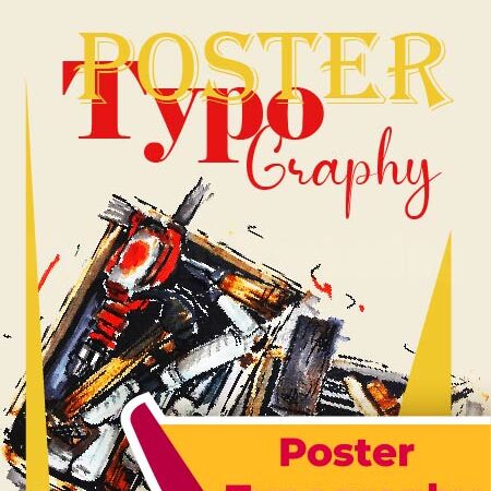
Poster typography often becomes the first thing people notice on a poster. Before colors, graphics, or layout, it is usually the headline or title that captures attention. That is exactly why we created our Poster Typography service at Minnions Marketing. Instead of relying on generic fonts or simple text placement, we design custom headline styles that give your poster its own visual voice. Whether the design is meant for print, social media, events, or promotional campaigns, the typography becomes the central visual element that holds the message together.
Our approach to poster typography design focuses on clarity, personality, and visual impact. We create custom headline treatments that match the purpose of the poster while still staying easy to read and visually balanced. Sometimes that means bold, expressive lettering for promotional graphics. Other times it may involve clean, structured title styling for professional campaigns. The goal is not just to make text look decorative, but to make the message stronger through thoughtful typography. This is especially important when the headline needs to communicate quickly across digital feeds or printed spaces.
When businesses work with Minnions Marketing, they usually want their posters to feel distinctive rather than template based. That is where custom poster headline styling makes a difference. Instead of forcing typography to fit a layout, we build the headline style so it naturally complements the entire design. The result is a poster that feels more intentional, more memorable, and far more aligned with the message it is meant to deliver.
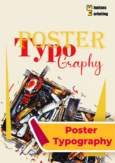
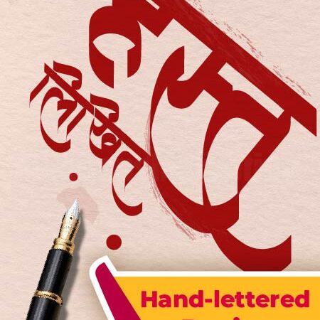
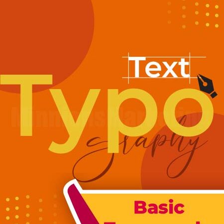
 Poster Typography