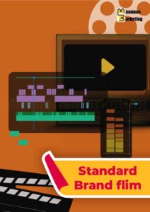
Interactive Report Elements exist because traditional reports stopped working the way people pretend they do. Long pages of charts, endless tables, and static slides look fine at first glance, but they rarely get read properly. At Minnions Marketing, we saw the same pattern over and over. Teams spent weeks preparing reports, only for decision makers to skim the highlights and miss the story behind the data.
This product was created to solve that exact problem.
Interactive Report Elements are modular, flexible components that turn digital reports into something people can actually engage with. Instead of forcing readers to scroll endlessly or interpret dense visuals on their own, we design interactions that guide them through the information naturally. Click to explore. Hover to understand. Expand only what matters.
This is not about adding complexity. It is about removing friction.
What Interactive Report Elements really are
At their core, these elements are thoughtfully designed interactive components built specifically for reporting environments. They can live inside PDFs, web-based reports, dashboards, presentations, or internal tools depending on how your team works.
Common elements include interactive charts, filterable data views, expandable sections, clickable summaries, visual callouts, embedded explanations, and navigation systems that let readers jump directly to what they need. Each element is designed to support the narrative of the report, not distract from it.
We approach interactive report design the same way we approach any serious communication task. First, understand the audience. Then, structure the information so it flows logically. Only after that do we design the interactions.
Why interaction matters in reporting
Most reports fail because they treat every reader the same. Executives want high-level insights. Managers want patterns and comparisons. Analysts want detail. Static reports try to serve everyone at once and end up serving no one particularly well.
Interactive Report Elements allow one report to work for multiple types of readers. Someone can skim key insights quickly, while another person can dive deeper into the data without needing a separate document. Interaction gives control back to the reader without losing structure.
This is especially important in digital environments where attention is limited. Well-designed interaction keeps people oriented and reduces cognitive load. Instead of asking readers to work harder to understand the report, the report adapts to them.
How Minnions Marketing approaches this differently
At Minnions Marketing, we do not treat interactive report design as a purely visual task. It is a communication problem first and a design problem second. Every interactive element is created with a clear reason for existing.
We start by understanding what decisions the report needs to support. Then we map out the information hierarchy. Only then do we design interactions that help surface insights at the right moment.
We also pay close attention to restraint. Not every chart needs interaction. Not every section needs animation. Overuse quickly becomes noise. The best interactive report elements often feel invisible because they simply make the experience smoother.
Where these elements fit in real workflows
Interactive Report Elements are designed to fit into how teams already work. They can be used in quarterly performance reports, investor updates, marketing analytics, research summaries, internal reviews, and client-facing documents.
They are especially effective when reports are shared digitally or presented live. During presentations, interactions allow presenters to respond to questions in real time without jumping between slides or documents. For asynchronous reading, they help readers move at their own pace.
These elements also work well as part of ongoing reporting systems, not just one-off reports. Once designed, they can be reused, adapted, and scaled as reporting needs evolve.
Designed for clarity, not novelty
One of the biggest mistakes in interactive reporting is designing for novelty instead of usefulness. Flashy interactions might look impressive, but they often slow people down or distract from the message.
Our focus is clarity. Interactions are subtle, purposeful, and intuitive. They follow familiar patterns so users do not have to learn how to use the report. Everything feels natural because it is designed to behave the way people expect digital information to behave.
That balance is what makes interactive report design effective rather than gimmicky.
A better experience for both creators and readers
Interactive Report Elements do not just benefit the people reading the report. They also help the teams creating them. When reports are designed with interaction in mind, information becomes easier to organize and update. Insights become clearer. Conversations become more productive.
Instead of explaining the same charts repeatedly, the report itself does some of the work. It answers common questions before they are asked and highlights what actually matters.
This is what reporting should feel like today. Clear, flexible, and built for how people actually consume information. Interactive Report Elements from Minnions Marketing are designed to make that shift practical, not theoretical.