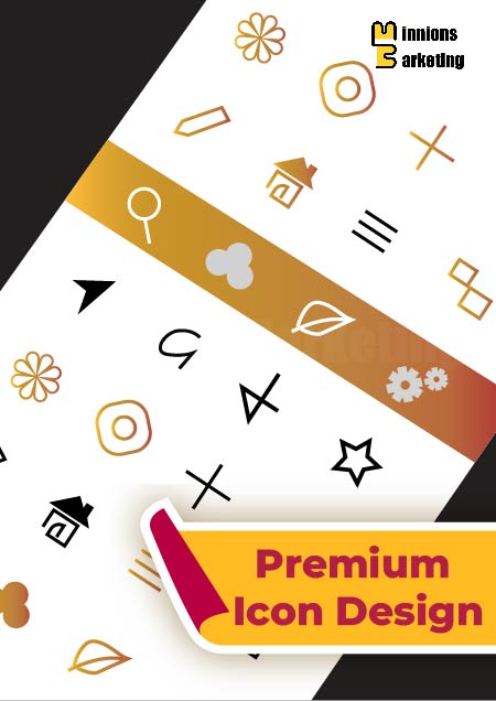
When a product interface, website, or application starts to grow, simple icons often stop being enough. You need a consistent visual language that explains features clearly without forcing users to read everything. That is exactly where a premium icon design plan becomes useful. At Minnions Marketing, this plan focuses on building a complete, well balanced icon set that fits naturally into your product or interface rather than looking like a random collection of graphics.
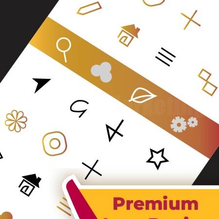
This plan typically includes a set of 10 to 15 icons designed as a unified system. Instead of designing icons individually with different styles, we create a structured custom UI icon set where stroke weight, spacing, proportions, and visual rhythm stay consistent across every icon. This matters a lot for dashboards, mobile apps, SaaS products, or feature sections on websites where icons appear repeatedly. The goal is not decoration. The goal is clarity. Each icon is designed so users instantly understand the feature or action it represents.
The process usually starts with understanding how the icons will actually be used inside your interface. Some projects need simple outline icons for clean UI layouts, while others require filled styles or slightly more expressive visuals. Once the direction is clear, Minnions Marketing develops the icon system so it scales smoothly across screens, product pages, and interface sections. The result is a refined icon pack that feels cohesive, purposeful, and ready to integrate directly into real digital products.
 Premium Icon Design Plan